Monthly Archives: February 2014

Speed Painting Pharus 7

Hello everyone!

Because we had a lot of great feedback and kind words the last time we showed you a concept art speed-paint, Gavin has kindly been recording his progress on some more amazing environmental concepts!

These ones are explorations into what kind of environmental features and terrain layouts would contribute the most to gameplay possibilities, and of course, look the coolest!

The video is 10x speed, and shows Gavin working on two concepts that go through many iterations and variations.

A few words from Gavin, our brilliant (and slightly eccentric) Concept Artist:


Hey guys I’ll make this brief because my postman literally JUST knocked and he’s waiting at the door for me to hold his package – that’s not a euphemism by the way, I’m really going to hold his package.. (yet I’m still typing)

In the video I’m drawing super fast in real time because my art director Matt is constantly in a God Of War, attack build-up position in case I slack. We start with a couple of in-game screenshots, a brief and reference imagery by our Level Designer Chris K. and Artist Joe.

As you might be able to spot from the video, there’s a couple design changes in artistic direction which happen as per feedback from the team who kindly drop in and keep the design on track to anticipate any game constraints or clashes with established features. Then after about two easy hours of painting–BOOM! … Another nine hours left of painting until there’s only 13 hours of painting left to reach the halfway mark. Or something like that, I don’t know – you do the math. Seriously do the math; it’s something crazy like two days of slaving away at a tablet. Who does that?! (ME.)

Either way I hope the video will enrich your life . Aaand the postman’s gone. THANKS guys. (Really, thanks – I probably love you all)


– Gavin


Here are the latest concepts for the pleasure of your eyeballs.
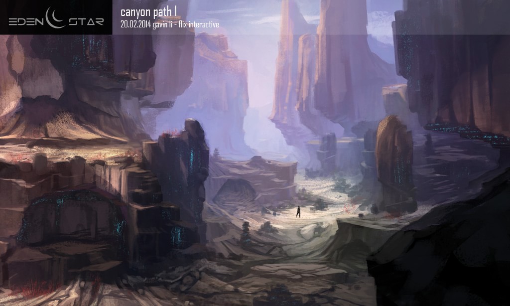
 

eden star canyon path concept

This image shows the entrances to caves, and monolithic overhanging rocks. The earth is cracked, possibly by tectonic activity, or perhaps by the passage of something of staggering size
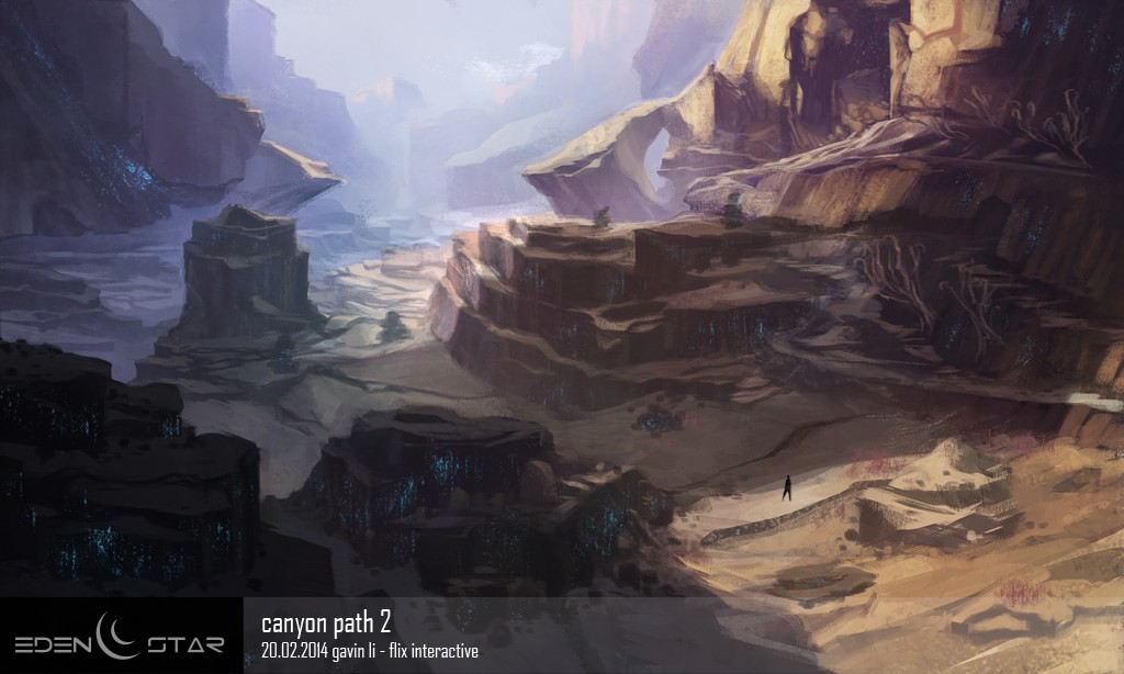
eden star canyon path concept

The gorge offers itself as a natural choke-point, making it the ideal place to construct defenses. The rocks are suffused with veins of luminescent crystal

We hope you were as blown away by Gavin’s mad painting technique as we were, and would love to hear your comments and questions!

Head over to the forums to talk to the Devs!

A Look Under the HUD

Hi all!

Tonight, I want to show you some things we’ve been doing with UI and some of the process behind it!

All images and video footage in this post do not represent the quality of the final product, and represent only work in progress.

In designing the HUD for our UE3 Tech demo, we wanted to create all the graphical elements in the angular style of Eden Star, taking inspiration from some of the best FPS games of the last 20 years including the original Metroid games, Deus Ex, Crysis, and Half-life.

Our ultimate goal is to make the most teal HUD ever created by man.

Jokes aside, Eden Star is not a typical run-and-gun shooter and therefore the form of the HUD needs to be tailored to the gameplay. For instance, outside the center reticle, we have the curved Energy and Resource meters, displayed prominently so they are always accessible. Based on player feedback, there has been a bit of confusion about what the bars represented, so this is being amended in the new HUD design.

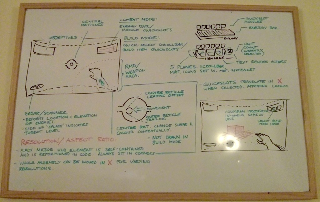
On the subject of our center reticle, most games make do with one reticle to aim. Eden Star has two, therefore making it twice as good as the average first-person shooter!


reticle dance

Actually, we did not decide on this without a good reason! The current reticle system is projected in 3D space, and enables the player to make fine aiming movements without needing to rotate the player’s whole view. All of our UI is being developed with stereoscopic vision in mind, and while the classic aiming system has worked very well on flat-screens for the last few decades, aiming with your face in virtual reality is probably not the best method! Rest assured, this UI method works brilliantly on a normal monitor too.

flix whiteboard game design

All our in-game UI is located in 3D space, as materials on planes. This method is not as processor / memory intensive as you might think, and opens up a huge range of possibilities for cool visual effects we can create.

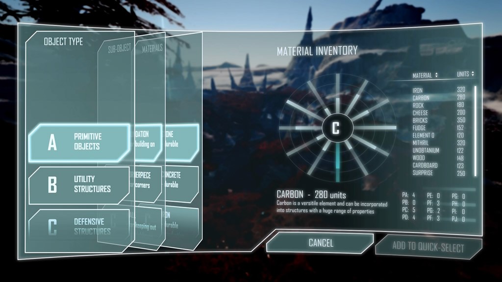
Our construction system in the UE3 Tech Demo was very basic, and did not require HUD elements, but the expanded construction system in the UE4 game will have many more features we need to communicate to the player, so this involves build-mode HUD elements, and a full-screen Construction UI and Inventory system, which we are trying to design to have a balance between utility and simplicity, and still look and feel as good as they can do.

eden star construction UI

The in-game menus of some games can overload the player with information, or be too much like accountancy programs, so our Lead UI designer has to plan our UI carefully, and mock up systems first on paper, then ideas are fleshed out in Photoshop and After Effects. We then work out the most basic and universal mechanical components that can be implemented on a first pass and these elements are built in the engine. The After Effects mockups act as useful references for the UI programmer, allowing us to review how elements should relate to one-another, and how the animated elements flow in sequence.

After feedback has been received, tweaks are made, and the UI Designer and Programmer work together to get all the elements boxed-out inside the Unreal 4 editor. Pretty much all of the UI can now be done inside UE4’s Blueprint system, using its visual node-based programming, and can be rapidly prototyped and continuously evaluated and tweaked as the process goes on.

When the UI is laid out correctly and the basic interactive elements, animations, materials and functions, gears, pulleys and rubber chickens are in place, the new system can be integrated into the rest of the game, and tested to see if it all works the way it is supposed to.

Usually there are a few changes that must be made, but when the UI element is developed to a satisfactory level, the Blueprint is then tidied up, commented, and made so any one of the team can see exactly what happens where inside the Blueprint, and make modifications if necessary. It’s an amazingly useful tool that enables even lowly Artists to mess about with things that would normally require a Programmer

After the Artist breaks the Blueprint, the Programmer then fixes it, thus balance is restored to the Universe.

I’ve enjoyed writing this overview for you, and it’s probably a little too long, but I hope you found it interesting!

We’ll be going into other elements and processes in future posts, so check back soon!

If you’ve got any questions for us regarding the UI or anything else, please post on the the forums!

Eden Star Update #8

Hi everyone!

We’ve got a double post tonight! First, this weekly Eden Star update post, and in a few hours, a BIG ONE about our UI and HUD. So stay tuned!

Here’s some of what the team has been doing:

Development team:

  • Continuing work on some awesome multiplayer LAN tests
  • Testing Network and executable builds

Designers:

  • Further passes over the large-scale map, and populating it with more interesting features
  • Prototyping new LOD (Level of detail) systems for organic assets
  • White-boxing terrain features

Artists:

  • Producing amazing, inspirational concept pieces for environment types and features
  • Recreating our old MATA-Tool particle effects, but 200% more awesome
  • Making the first visual pass, in-engine, of our Construction UI (we will touch on this in our next update!)

Animators:

  • Refining movement anims, getting them to replicate across network
  • Further passes on wall-run and freerunning animations for 3rd-person